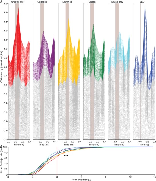
Figure 5. Variations in response strength.

A, stacked line plots illustrating the peri‐stimulus time histograms of all Purkinje cells recorded under either of the six indicated stimulus conditions. The cells are ordered based upon their peak responses (calculated as Z value) during the 200 ms interval following stimulus onset, with the cell with the lowest response at the bottom of each graph. The grey lines indicate cells with a peak response deemed not significant (Z < 3) and the coloured lines indicate the significant responses (Z > 3). The graphs are normalized so that the upper line depicts the average of all cells. As shown in Fig. 4 B, we cannot discriminate between responsive and non‐responsive cells in an all‐or‐none fashion. Instead, the cells form a continuum that ranges from non‐responsive to highly responsive. As this way of plotting relies on the numerical average, a skewed distribution can put emphasis on a relatively small group of cells. The Purkinje cell responses are therefore also compared using cumulative histograms (B) using the same colour scheme as in A. From this representation, it is confirmed that whisker pad and lower lip stimulation yield the strongest responses, while visual stimulation (LED) recruits a few cells with a relatively strong response, increasing the numerical average (see A). Here, we tested the complete distributions (*** P < 0.001; Kruskal–Wallis test). Pair‐wise comparisons of all stimulus conditions are presented in Fig. 6.
