
Figure 5.
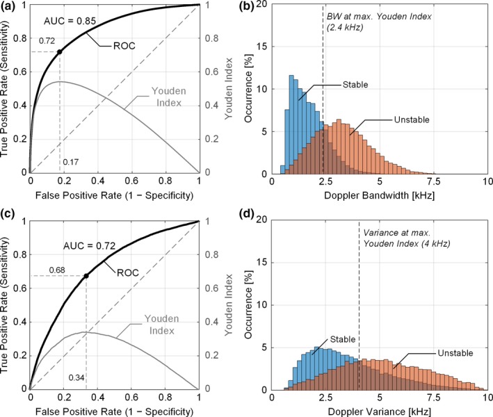
Sensitivity and specificity analysis of DUBI. (a) ROC curve (dark line) for unstable flow classification (with an area under curve of 0.85) and the corresponding Youden index (gray line) at different false positive rates; the black dot indicates the optimal classification performance when Youden index attained its maximum. The diagonal dash line represents the theoretical ROC curve for random guessing. (b) Doppler bandwidth distributions from stable (in blue) and unstable flow (in orange) regions, with the optimal bandwidth threshold marked by the black dash line. The deeper color depicts the overlapping area between the two distributions. Corresponding result for Doppler variance mapping are shown in (c) and (d) for comparison. The area under ROC curve for Doppler variance mapping was 0.72. [Color figure can be viewed at wileyonlinelibrary.com]