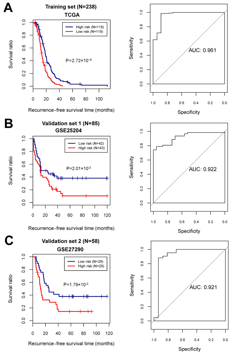
Figure 5.
The Kaplan-Meier (KM) survival curves and the area under the receiver operating characteristic (AUC) curves based on the risk score system. (A) The KM curve (left) and AUC curve (right) for the training dataset. (B) The KM curve (left) and AUC curve (right) for the validation set 1 (GSE25204). (C) The KM curve (left) and AUC curve (right) for the validation set 2 (GSE27290). In KM curves, blue and red curves separately represent the low- and high-risk groups.

