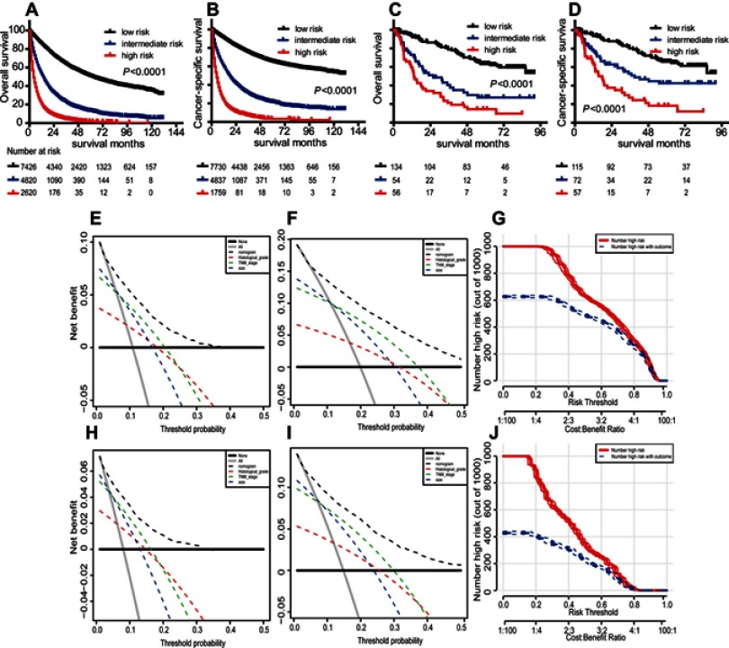
Figure 5.
Curves for OS and CSS in the entire SEER cohort (A and B) and curves for OS (C) and CSS (D) in the external validation cohort based on risk stratification by the nomogram models. DCA of the predictive nomograms and single factor models (TNM stage, histological grade and tumor size). The nomograms were compared against single factor models in terms of 1- and 3-year OS (E and F) and CSS (H and I). Clinical impact curves of the nomograms for OS (G) and CSS (J) in patients with HCC in the SEER discovery set. (E–H) Dashed lines indicate the net benefit of the models across a range of threshold probabilities. The horizontal solid black line represents the hypothesis that no patients reached the endpoint, and the solid gray line represents the hypothesis that all patients reached the endpoint. (G and J) At different threshold probabilities within a given population, the number of high-risk patients and the number of high-risk patients with the outcome were plotted.

