
Figure 2.
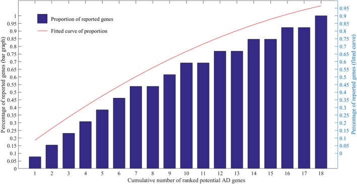
The distribution of reported genes among the ranked potential AD target genes. The bar graph shows percentage of reported genes in the first N identified potential AD genes which are ranked by RRA method. For example, there are 53.8% reported genes in first seven identified potential AD target genes. The red line is a fitted curve of the percentage values. The left and right ordinates show the percentage values of bar graph and fitted curve, respectively