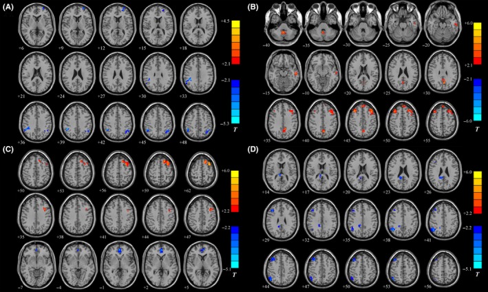
Figure 1.

Statistical parametric map showing the significant differences in the PCC FC between different groups. A, The PD‐NCI group vs the HC group. B, The PD‐MCI group vs the PD‐NCI group. C, The PDD group vs the PD‐NCI group. D, The PDD group vs the PD‐MCI group. Blue and green regions indicate decreased connectivity to the PCC of the former group. Red and yellow areas represent regions showing significantly increased connectivity to the PCC of the former group. P < 0.05 was set as the threshold for display (cluster size: >54 voxels; AlphaSim corrected)
