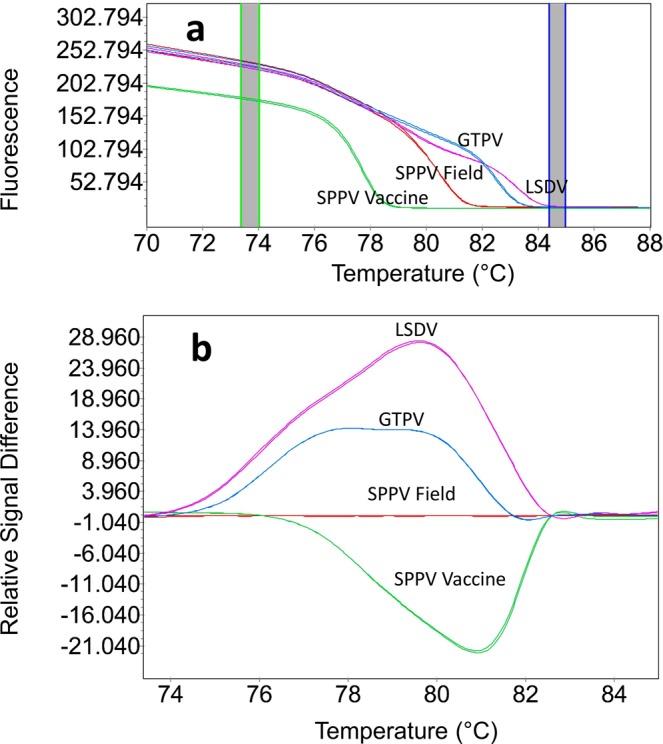
Figure 3.

Normalized HRM plots for SPPV vaccine and other CaPVs. (a) The graphs visualize the representative profiles of normalized melt curve and (b) difference melting curve plots. Each of the genotype species were given a different colored line. The two dark columns in the melting curve plot (a) represent pre and post melting normalization regions. In the difference plot (b), SPPV field isolates have been selected as the reference for displaying the deviations between SPPV vaccine from GTPV and LSDV field isolates.
