
Figure 2.
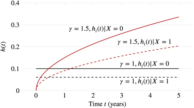
Visualisation of the true hazard rate over follow‐up time in the two data‐generating mechanisms. Black (flat) lines are for the first data‐generating mechanism, where γ = 1; Red curves are for the second, where γ = 1.5 [Colour figure can be viewed at wileyonlinelibrary.com]