
Figure 2.
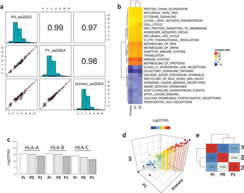
Functional enrichment analysis of the primary and PDX samples. a) Correlation plot of the ssGSEA normalized enrichment scores (NES) across the samples. b) Heatmap representing the top and bottom enriched pathways scored by ssGSEA. c) Barplot showing the expression of HLA molecules (HLA-A, HLA-B and HLA-C) across the samples. d) 3D scatter plot of the expression levels of 110 TAP-related genes showing strong correlation across samples. e) Heatmap showing the correlation coefficient of the TAP processing genes across all samples.