
Figure 3.
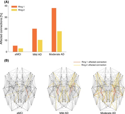
(A) Bar plot showing the percentage of affected connections for the first and second ring in each group of patients. (B) NOS‐weighted brain network for each group of patients showing the affected connections colored in orange for the first ring and in yellow for the second ring. The locations of homologous nodes, based on anatomy, have been symmetrized. For all groups, a greater percentage of connections were affected in the first ring as compared to the second (A) and a progressive increase of affected connections was observed across groups (B).