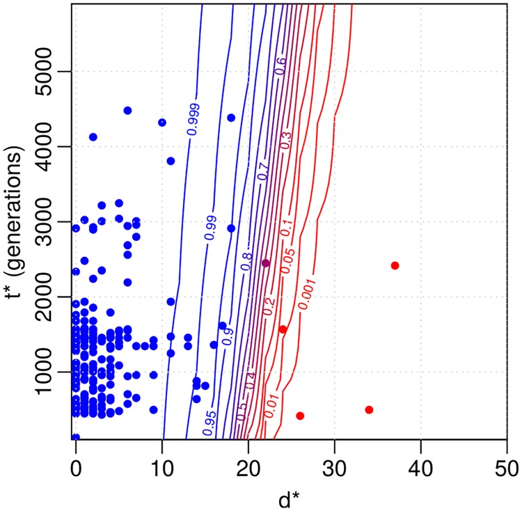
Fig 7. Results for the Project CLEAR MRSA data.
Contour plot for same strain probability of a distance d* and time interval t* based on the fitted model. The coloured points denote the observations that were used to fit the model. Blue colour indicates large same strain probability. Distances greater than 50 are not shown and are classified as different strains with probability one. 6, 000 generations on the y-axis correspond to approximately one year.

