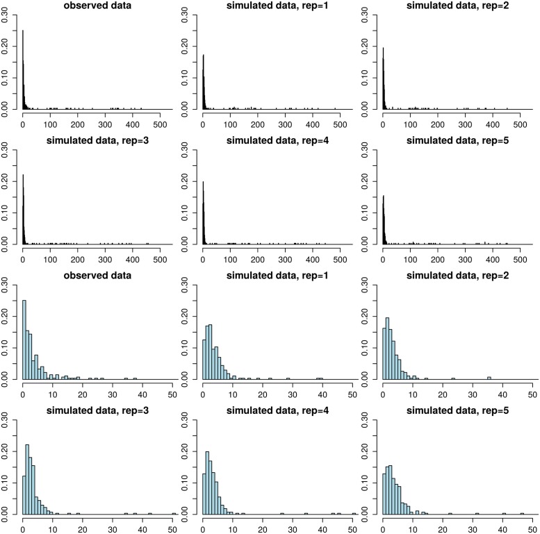
Fig 8. Model validation using posterior predictive checking.
The histogram in the upper left corner shows the observed distance distribution in the Project CLEAR MRSA data, the other figures in the top two rows show the corresponding distances in replicate data sets simulated from the fitted model. The bottom two rows show the same histograms zoomed to range [0, 50]. The replicate data sets look overall similar to the observed data, demonstrating the adequacy of the model. However, the amount of zero distances is underestimated and the frequencies of small positive distances tend to be slightly overestimated.

