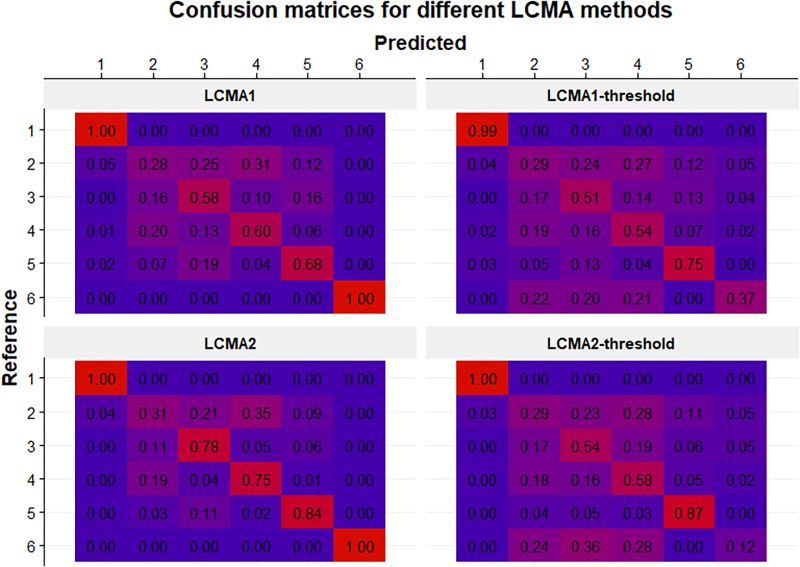
FIGURE 6.
Confusion matrices for each CMA estimate (identified by the panel titles) for 100 simulations of 1000 individuals. Rows represent the pre-specified (i.e., reference) groups (from 1 to 6 in top to bottom order) and columns represent the predicted clusters after relabelling (from 1 to 6 in left to right order). Numbers in cells indicate the mean frequency with which patients from the reference group were classified in the predicted cluster (i.e., 0.25 in the 2:3 cell in the top panel means that on average 25% of the patients in the reference group 2 were classified into cluster 3). Colors range from blue (0%) to red (100%).

