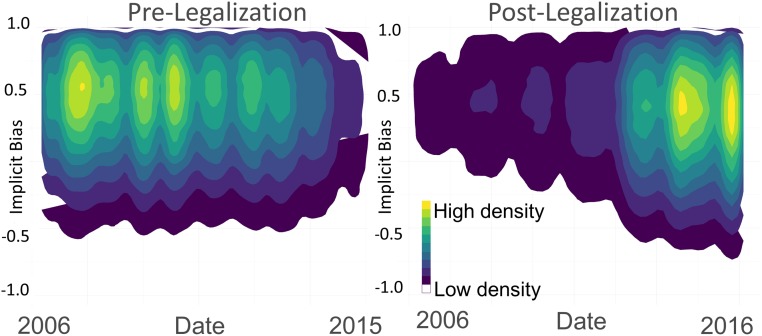
Fig. 2.
Contour plots of implicit bias over time before (Left) and after (Right) legalization of same-sex marriage, across all states, showing the decreasing trend in implicit bias over time post legalization. Because there are several hundred thousand data points, contour plots used as data are too high density to visualize with scatterplots. Higher density values (brighter colors) represent more observed data points in that region of the figure.

