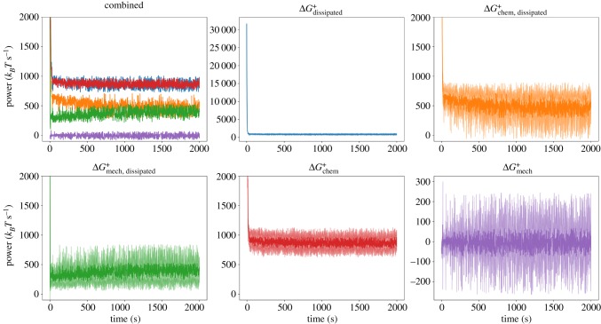
Figure 2.
Top left: Combined trajectories of five quantities tracked during a MEDYAN simulation, averaged over 10 separate runs. The colour coding is indicated by the remaining panels. Note the close overlap between and . In the remaining panels, the individual trajectories are visualized with their standard deviations at each time point over the 10 runs visualized as lighter curves above and below the main curve. In the plots for and , the full range is visualized; however, this range is cropped in the other plots to aid visibility. (Online version in colour.)

