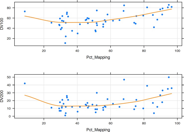
Fig 3. Percent mapped RNAs by DV100 and DV200 values.
Plots showing percent mapped RNAs for samples with varying degrees of fragmentation, as depicted by fragment distribution values (DV100 (top plot) and DV200 (lower plot)). Every blue dot represents an individual sample, and the orange line represents the curve of best fit.

