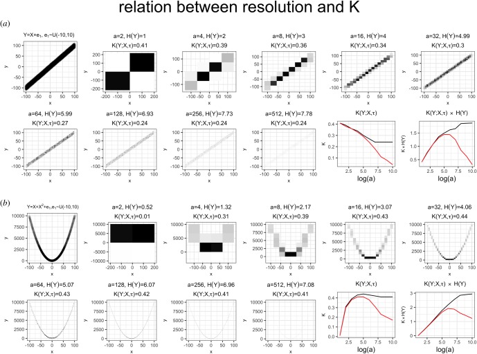
Figure 5.
Illustrative example of how K varies in relation to the resolution measured for Y and X, depending on the shape of the pattern encoded. The figures and all the calculations were derived from a simulated dataset, in which the pattern linking explanandum to explanans was assumed to have noise with uniform distribution, as described in the top-left plot of each panel. Black line: entropies and K values calculated by maximum-likelihood method (i.e. counting frequencies in each bin). Red line: entropies and K values calculated using the ‘shrink’ method described in [18] (the R code used to generate the figures is provided in electronic supplementary material). Note how the value of K and its rescaled version H(Y)K have a unique maximum.

