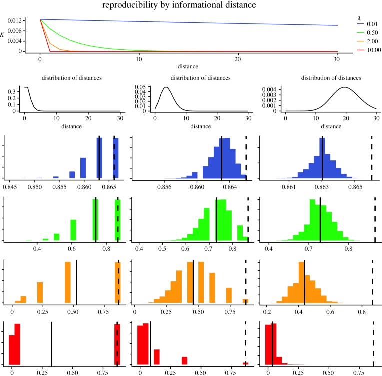
Figure 8.
Simulated distribution of results of reproducibility studies, under varying conditions of distances (e.g. number of differences in methodologies), d, and average impact per distance λ. The top panel shows how K declines as the number of divergences increases, depending on different values of λ. Panels in the second row show the probability distribution of the simulated distances (Poisson distributions, with mean 1, 5 and 20, respectively). The nine panels below show the distribution of correlation coefficients of reproducibility studies under each combination of number of distances and their impact. The impact is colour coded as in the top panel. For further discussion see text.

