
Fig. 7. Comparison of subtomogram averages.
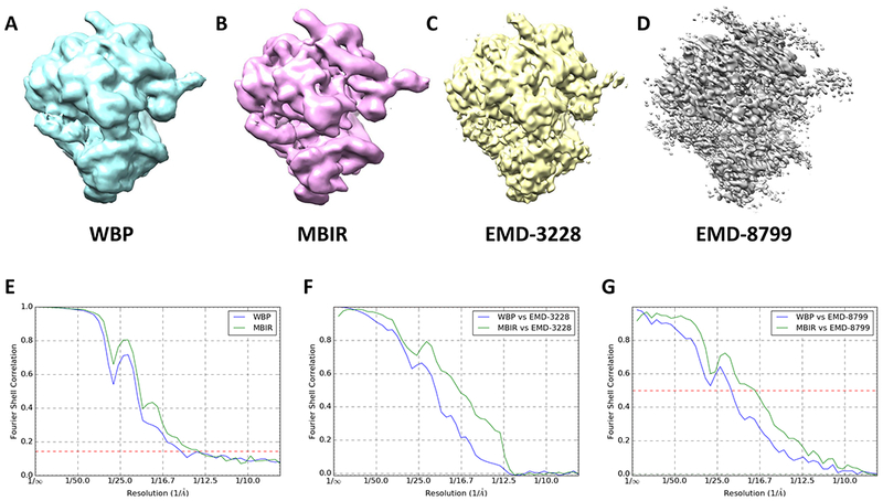
(A) the averaged map of WBP’s subtomograms. (B) the averaged map of MBIR’s subtomograms. (C) the published subtomogram average map EMD-3228. (D) the published subtomogram average map EMD-8799. (E) the comparison of the “gold standard” FSC curves between WBP and MBIR maps. (F) FSC curves between the reference map EMD-3228 in (C) and the averaged subtomograms (WBP in blue and MBIR in green). (G) FSC curves between the reference map EMD-8779 in (D) and the averaged subtomograms (WBP in blue and MBIR in green).