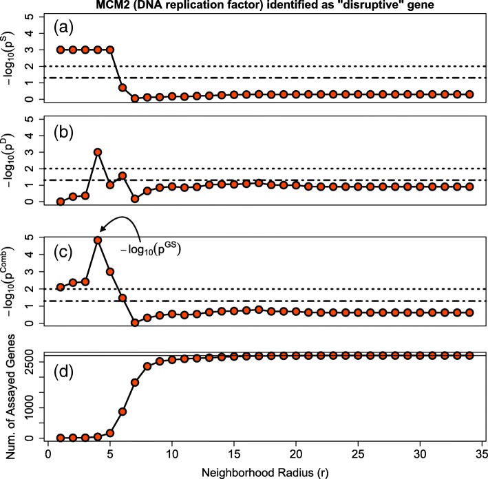
Fig. 4.
Illustration of Method. Displayed are the results for the gene MCM2 when our algorithm was applied to Ovarian Cancer Study GSE14764. a shows − log10(pSphere) vs the Neighborhood Radius. b shows − log10(pDecay) vs the Neighborhood Radius. c shows − log10(pCombined) vs the Neighborhood Radius. d shows the Number of Assayed Genes vs the Neighborhood Radius. In the top three plots, the dashed and dotted lines correspond to a significance level of 0.05 and 0.01 respectively. In the bottom plot, the solid line corresponds to the total number of genes assayed and on the network

