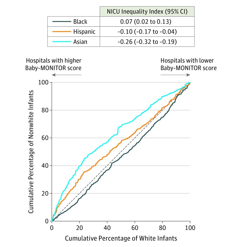
Figure 2. Lorenz Curves for Inequality of Care by Race/Ethnicity in US Neonatal Intensive Care Units (NICUs).
Hospitals were ranked by their Baby-MONITOR (Measure of Neonatal Intensive Care Outcomes Research) scores, and the cumulative population percentages of white and minority infants were plotted on the x- and y-axes. If all racial/ethnic groups had the same quality distribution as the overall population, the curves would fall on the 45° diagonal line. The light blue line (left) represents Asian infants. The orange line (middle) represents Hispanic infants. The dark blue line (right) represents black infants.

