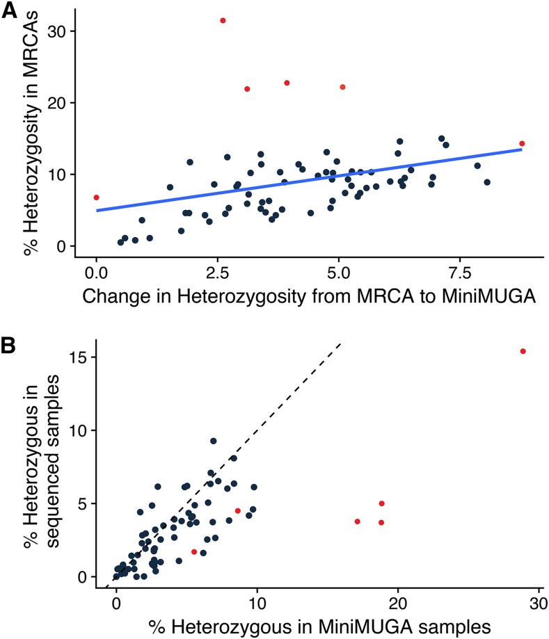
Figure 3.
Residual heterozygosity levels in CC populations. (A) Change in CC strain heterozygosity compared to total percent heterozygosity. Red dots represent the 6 new strains. Dark blue line represents the regression for change in heterozygosity compared to heterozygosity levels in the MRCAs. (B) Heterozygosity levels in sequenced samples compared to heterozygosity levels in MiniMUGA samples. Dotted black line represents the equal level of heterozygosity between both populations. Dots to the right of the dotted line are samples where the sequenced sample underestimates heterozygosity and dots to the left are where the sequenced sample over represents heterozygosity.

