Figure 1.
Promoters Respond Differently to Their LAD Environment
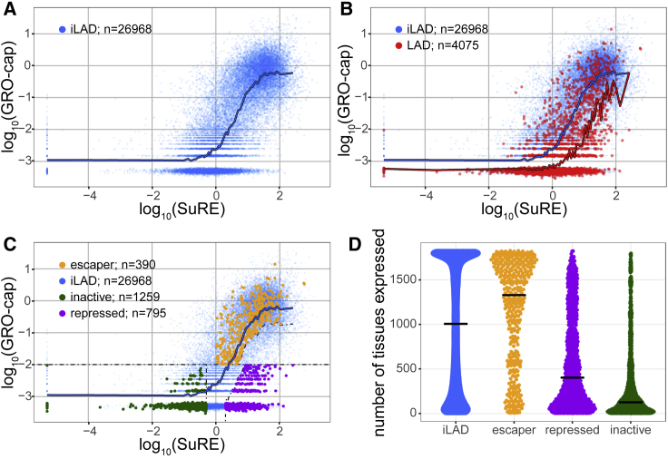
(A) Relation between promoter activity in the native context (GRO-cap) and in episomal plasmid context (SuRE) for all inter-LAD (iLAD) promoters (blue dots). Blue line shows sliding window average with a bin size of 501 promoters along the SuRE expression axis. GRO-cap data are from Core et al. (2014); SuRE data are from van Arensbergen et al. (2017).
(B) Comparison of all promoters in LADs (red) and iLAD regions (blue). Red line shows sliding window average of LAD promoters, similar to blue line in (A).
(C) Same as in (B) but with three classes of LAD promoters highlighted in green, purple, and yellow. Dotted lines depict cutoff lines used for the definitions (see STAR Methods).
(D) Promoter classes differ in their tissue expression distributions. Plot shows the number of tissues and cell types (out of 1,829) in which promoter activity was detected by FANTOM study (Forrest et al., 2014). Each dot represents a promoter in either iLADs (blue) or one of the three LAD promoter classes (yellow, purple, and green).

