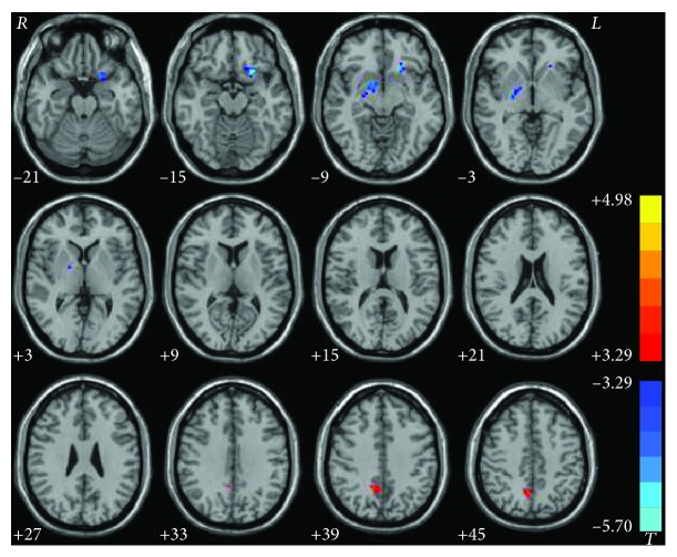
Figure 2.
Statistical maps showing degree centrality differences between patients and controls. Red and blue denote higher and lower degree centrality values, respectively, in the patients compared to the controls. The color bars indicate the T values of the group analysis (P < 0.05, GRF corrected).

