
Figure 1.
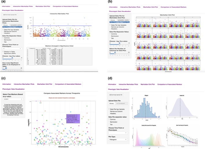
Main interface of the ShinyAIM application. Screenshots of panels for the main tabs are shown. (a) The “Interactive Manhattan Plots” tab allows users to display interactive Manhattan plots for a selected time point. Users have the flexibility to choose the significance level and can display the top associated markers in tabular format. (b) The “Manhattan Grid Plot” tab allows users to visualize Manhattan plots for all time points simultaneously. Users have the flexibility to choose the significance level and the number of columns in the grid plot. (c) The “Comparison of Associated Markers” tab allows users to filter markers based on p‐values, display a scatter plot for comparisons across all time points, and search for co‐localized markers. (d) The “Phenotypic Data Visualization” tab generates histogram and density plots and summarizes trends in temporal phenotypic data in the form of box plots