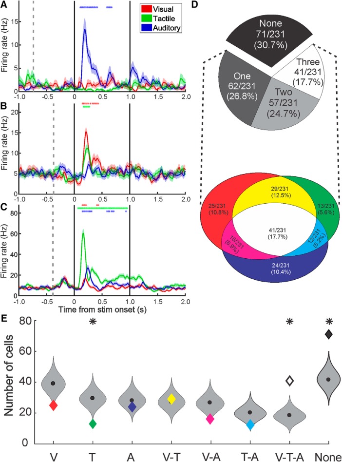
Figure 2.
Types and proportions of multisensory neurons in the monkey amygdala. A–C, Example neural responses to stimuli of a single or multiple sensory modalities: Red represents visual. Green represents tactile. Blue represents auditory. The mean spike density function (solid lines) ± SEM (shaded regions) for each sensory modality shows the amplitude and the time course of the response averaged across eight stimuli. *Time segments in which the firing rate was significantly different from baseline. Vertical gray dotted line indicates the onset of the fixspot. Solid black lines indicate the onset and offset of the stimulus. D, Classification of responses. Top, Pie chart represents the proportion of all recorded cells that responded to 0, 1, 2, or 3 modalities. Bottom, Venn diagram represents the ratio of responsive neurons classified as each combination of responses to visual, tactile, and auditory stimuli: Red represents visual only. Green represents tactile only. Blue represents auditory only. Yellow represents visual-and-tactile. Magenta represents visual-and-auditory. Cyan represents tactile-and-auditory. White represents visual-and-tactile-and-auditory. E, Binomial probability density functions (gray violin plots), cut at the 0.06 and 99.94 percentiles, for the number of cells in each response category given the observed rates of visual, tactile, and auditory responses. Colored diamonds represent the observed number of cells for the category (same color code as in D). Black circle represents the median. Above violin plots, *The observed value was significantly different than expected from the binomial probability density function.

