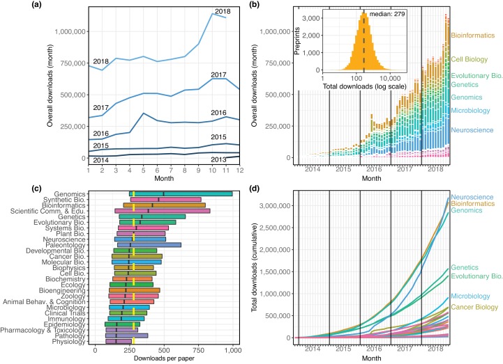
Figure 2. The distribution of all recorded downloads of bioRxiv preprints.
(a) The downloads recorded in each month, with each line representing a different year. The lines reflect the same totals as the height of the bars in Figure 2b. (b) A stacked bar plot of the downloads in each month. The height of each bar indicates the total downloads in that month. Each stacked bar shows the number of downloads in that month attributable to each category; the colors of the bars are described in the legend in Figure 1. Inset: A histogram showing the site-wide distribution of downloads per preprint, as of the end of November 2018. The median download count for a single preprint is 279, marked by the yellow dashed line. (c) The distribution of downloads per preprint, broken down by category. Each box illustrates that category’s first quartile, median, and third quartile (similar to a boxplot, but whiskers are omitted due to a long right tail in the distribution). The vertical dashed yellow line indicates the overall median downloads for all preprints. (d) Cumulative downloads over time of all preprints in each category. The top seven categories at the end of the plot (November 2018) are labeled using the same category color-coding as above.
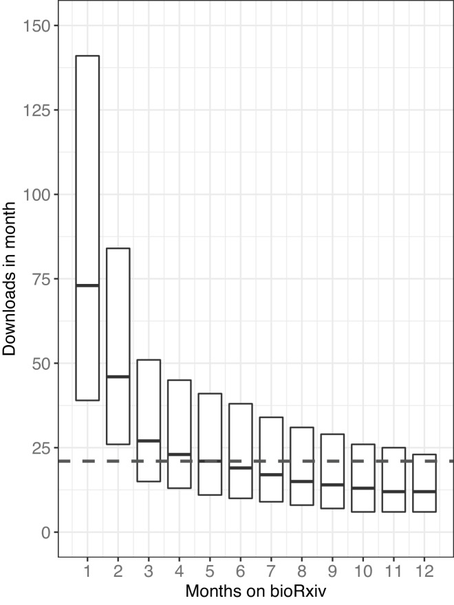
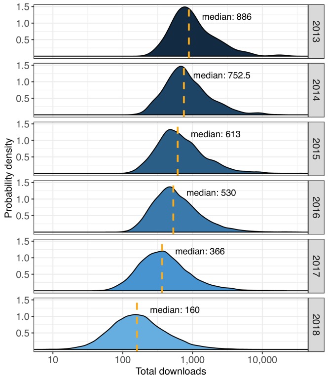
Figure 2—figure supplement 1. The distribution of downloads that preprints accrue in their first months on bioRxiv.
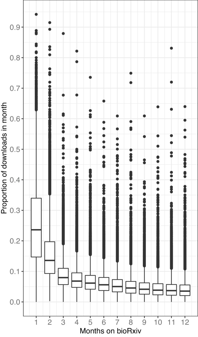
Figure 2—figure supplement 2. The proportion of downloads that preprints accrue in their first months on bioRxiv.
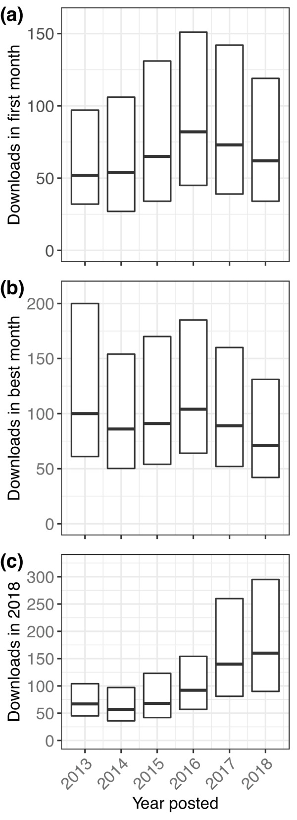
Figure 2—figure supplement 3. Multiple perspectives on per-preprint download statistics.
