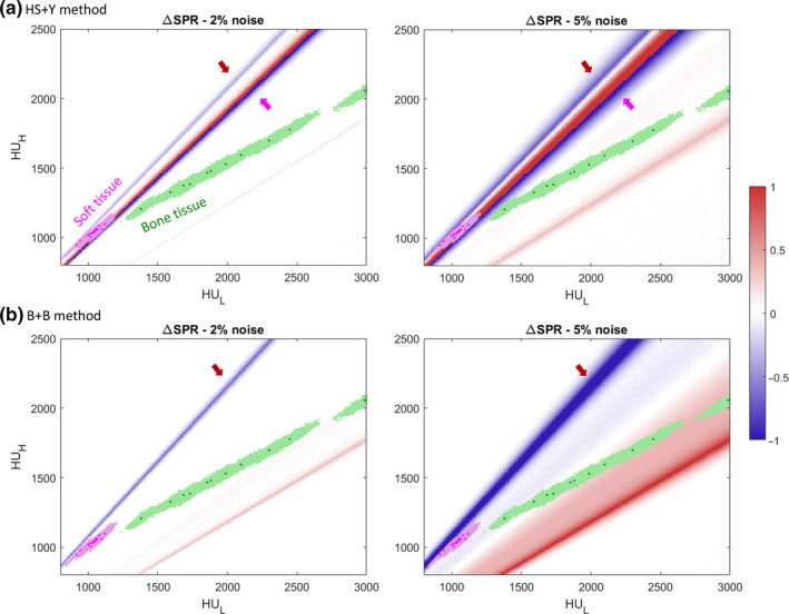
Figure 6.

Heatmap of the SPR mean shift (∆SPR) using (a) the HS + Y method and (b) the B + B method at noise levels of 2% and 5%. Values are capped at (−1, 1) for ease of view as shown in the colorbar on the right. Grid size is 10 × 10. Magenta dots mark soft tissues and green dots mark bone tissues from the ICRU 44 reference. Shaded areas of each color denote 2000 individualized human tissue population. Arrows indicate the regions with hard threshold as shown in Fig. 4. [Color figure can be viewed at wileyonlinelibrary.com]
