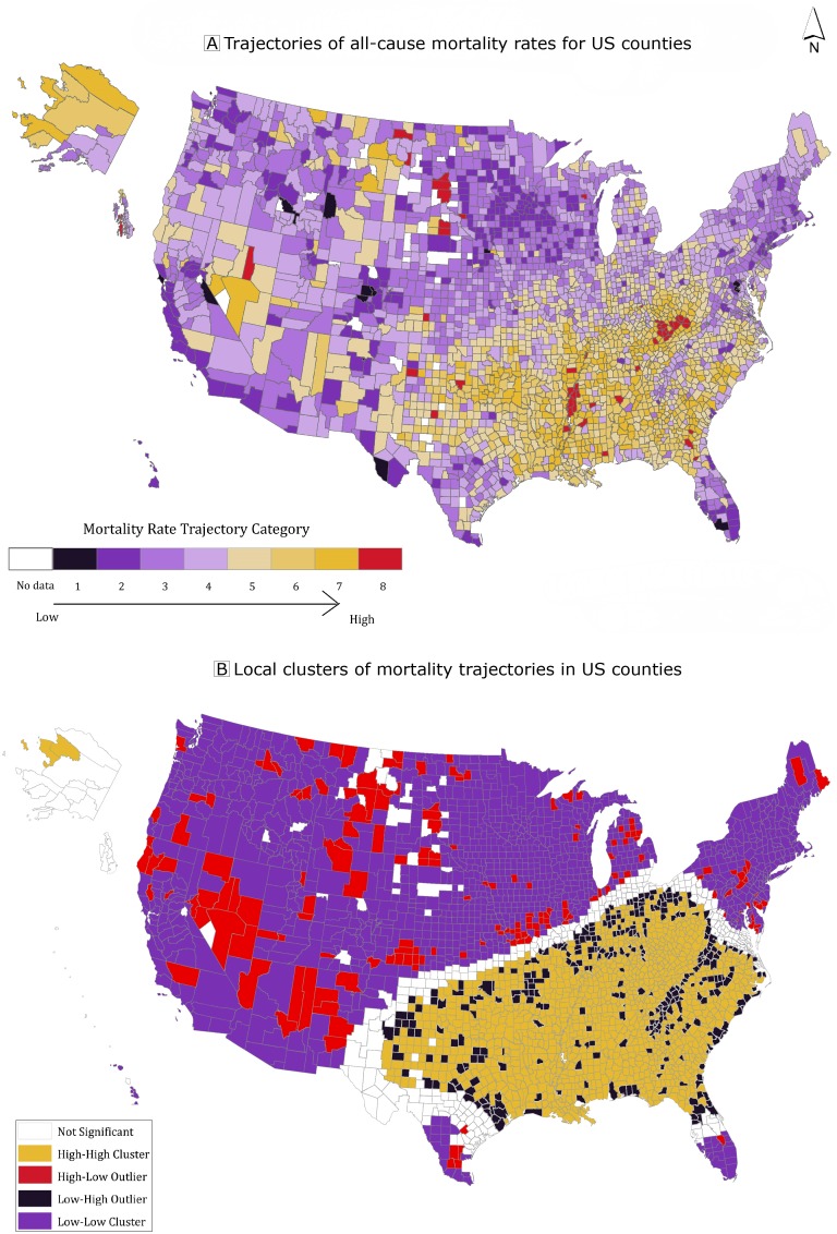
Figure 2.
Trajectories of age-adjusted all-cause mortality in US counties using group-based trajectory models, 1999–2016. The outcome measure used to generate rate trajectories was the yearly, age-adjusted, all-cause mortality rate of the county. Panel A: Trajectories of all-cause mortality rates for US counties. Panel B: Local clusters of mortality trajectories in US counties detected by using local indicators of spatial association (LISA). The 4 categories of significant spatial clusters (P < .05): 1) high–high clusters representing all counties with high mortality, the worst trajectory group; 2) high–low outliers representing counties in the worst trajectory groups near counties in the most favorable trajectory groups (at-risk counties doing worse than those around them); 3) low–high outliers representing counties in the best trajectory groups near counties in the worst trajectory groups (resilient counties doing better than those around them); and 4) low–low clusters of counties in the most favorable trajectory groups. Source: 1999–2016 Compressed Mortality File, Centers for Disease Control and Prevention (14).

