Fig. 4.
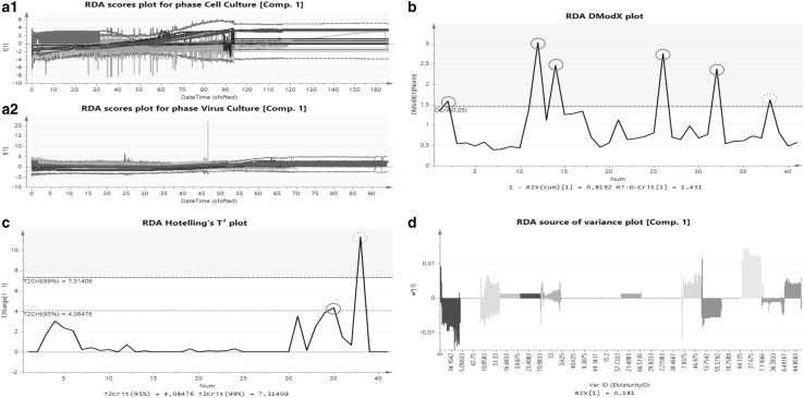
Plot summary of the RDA approach. a.1 Scores plot of the component 1 of cell and a.2 virus culture phase. The green dashed line represents the average of all batches. The red line represents the 99% (± 3 Sigma) confidence interval (CI) calculated using all the selected batches. Abnormal batches which are located outside the red line could be identified just within cell culture phase. b DModX chart of the batch-level monitoring. This kind of plot is used to identify outlying batches in orthogonal direction, which are located above the model population. If a batch exceeds the red dashed line, representing the 95% CI of the model population, the batch can be stated as different and is marked with a red circle. c Hotelling T2 plot. This plot is used to identify outliers in scores direction, which are batches located next to the model population. Batches larger than the yellow dashed line (95% CI of the model population) can be stated as dubious, while batches located above the red dashed line (99% CI of the model population) can be seen as serious outliers, always marked with a red circle. The most crucial observation is outside the CI in scores and orthogonal direction, red dashed circled run. d Source of variance plot. This plot displays the share in total variance of all independent variables used for model building onto the response variable. A high bar graph indicates high influence on the response at this time point. (Color figure online)

