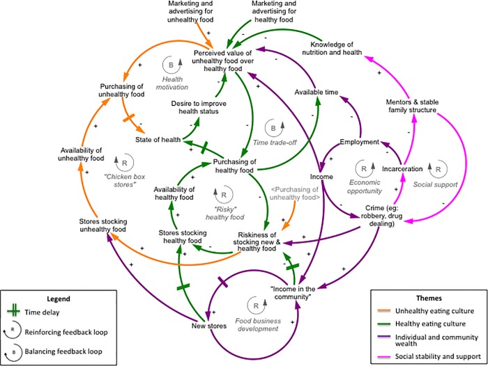
Fig 1. Themes and feedback loops in the synthesized causal loop diagram, initiated around the question, “What affects access to fresh and affordable food in Central West Baltimore?”*.
*Solid lines with positive polarity (+) represent a relationship that can interpreted in two ways: increase in a factor causes an increase in the receiving factor, and a decrease in a factor causes a decrease in the receiving factor; solid lines with negative polarity (-) represent a relationship that can be interpreted in two ways: increase in a factor causes a decrease in the receiving factor, and a decrease in a factor causes an increase in the receiving factor.

