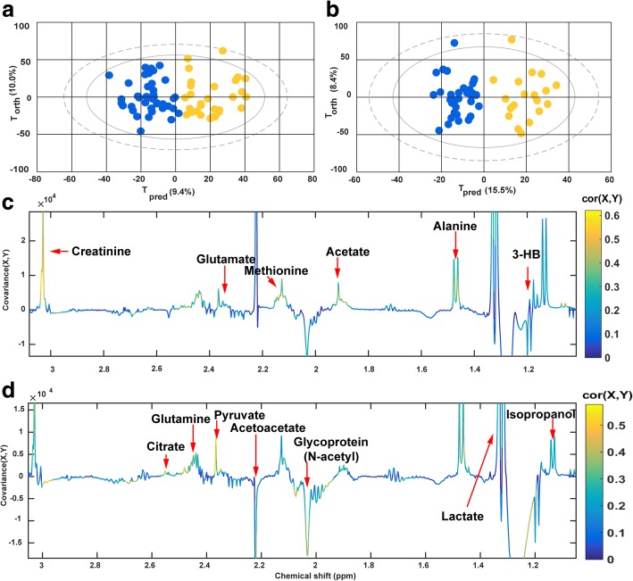
Fig. 2.
OPLS-DA between septic shock survivors and non-survivors at H0 and H24. a, b Score plots for the H0 and H24 models, respectively. Blue dots represent the survivors and yellow dots represent the non-survivors. Tpred: The components that predict the differences between the groups; Torth: components that do not predict the differences between the groups; c, d Loading plot for the H0 and H24 models, respectively. The color of the peaks indicates the correlation between the marked peak and the classification of the sample. Colors that are close to red correspond to a higher correlation. Positive peaks in the loading plot correspond to metabolites which increased in non-survivors; negative peaks correspond to metabolites that decreased in non-survivors

