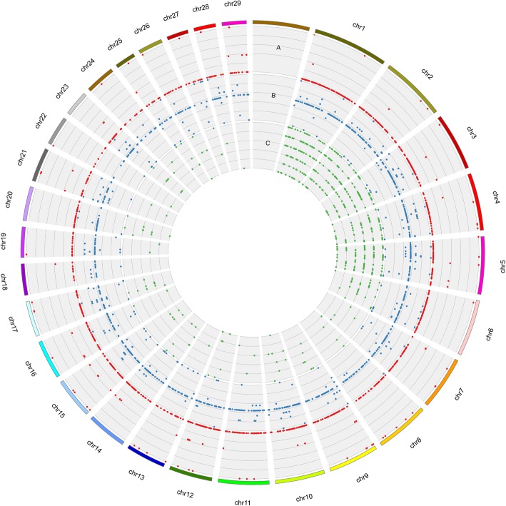
Fig. 4.
Circos plot of CNVR distributions (a), harbored genes (b), and QTLs (c). Red plots on different tracks, from outside to inside, in circle A represent gain, both gain and loss, and loss events, respectively. Blue plots, from outside to inside in circle B, represent rRNA, snoRNA, snRNA, protein coding genes, pseudogenes, processed pseudogenes, miscRNA, and miRNA, respectively. Green plots in circle C represent reproduction QTLs, production QTLs, milk QTLs, meat and carcass QTLs, health QTLs, and exterior QTLs, respectively

