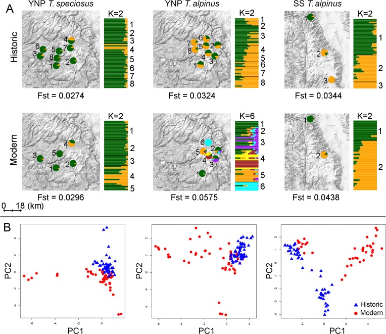
Fig 2. Temporal and spatial population genetic structure.
(A) Genetic clustering by general sampling locality (left, pie charts) and individual (bar graph to the right of each map) across historic and modern samples based on ngsAdmix analyses. Each individual is partitioned into colored segments that indicate cluster membership. Pie charts represent the sum of all individuals’ membership in each cluster at each general locality on the map. Proximate individual sample localities were pooled for clarity following Rubidge and colleagues [33]. The inferred best number of clusters (K) is shown on the top of each bar graph. Global FST estimates between localities are indicated at the bottom of each map. (B) Each data point in the PCA plot represents an individual specimen. The first and second two principal components (PCs) explain 3.7% and 2.6% of the total genetic variance.

