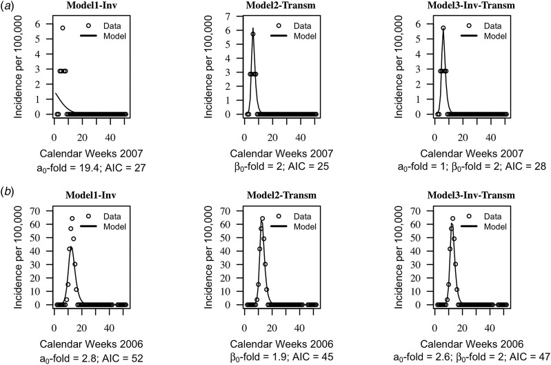
Fig. 2.
Trajectory matching plots of observed weekly incidence data and models’ predictions. Data (hallow circles) and models predictions (black solid line). (a) Health centre year with the poorest fitted data. (b) Health centre year with the best-fitted data. a0-fold and β0-fold indicate the seasonal fold increase of the invasion and transmission rate (respectively) relative to their baseline or average value. Model1-‘inv’: seasonal forcing of the invasion rate alone, model2-‘transm’: seasonal forcing of the transmission rate alone, and model3-‘inv-transm’: seasonal forcing of the transmission and invasion rate. Trajectory matching plots for all 64 health centre years are provided in Supplementary Figs S1–S3. Simulations are based on best-fit estimates of the parameters.

