. 2019 May 7;8:e47098. doi: 10.7554/eLife.47098

Figure 2. spaSPT of Pol II in infected cells shows no change in diffusion but an increase in binding.

(A) Example frames from spaSTP localization and tracking. Scale bar is 1 µm. (B) spaSPT experiments in infected cells at different times post infection. RCs are identified using Pol II fluorescence and used to make masks for sorting trajectories (green inside RCs; gray outside). (C) Zoom-in of trajectories in infected and uninfected cells. Red arrows show examples of traces with restricted movement. (D) Jump length distributions between consecutive frames of spaSPT trajectories. Histograms pooled from uninfected cells (n = 27), or HSV1 infected cells between 4 and 6 hpi (n = 96). Each distribution is fit with a two-state model. Inset shows depiction of two-state model where Pol II can either be freely diffusing or DNA-bound. (E) Mean apparent diffusion coefficient from the two-state fit in (D). Error bars are the standard deviation of the mean, calculated as described in Materials and methods. (F) FLIP curves comparing the rate of fluorescence loss after photobleaching Pol II in uninfected and HSV1 infected cells. Schematic shows location of bleaching laser (red crosshairs) and the region measured (black crosshairs). (G) Cumulative distribution function of the mean flanked by the SEM for jump lengths of molecules entering (left) or exiting (right) RCs. The distribution for HSV1-infected cells is compared to the distribution of jump lengths when RC annotations have been shuffled randomly. (H) Mean fraction of bound molecules from the two-state fit in (D). Error bars are the standard deviation of the mean, calculated as described in Materials and methods.

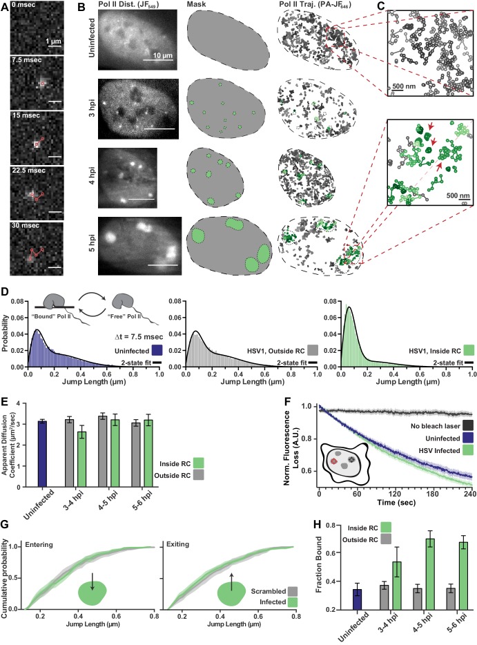
Figure 2.

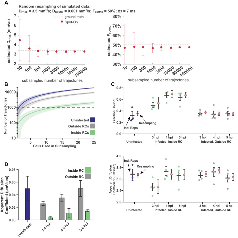
Figure 2—figure supplement 1. Sampling statistics and quality measurements of spaSPT.

Figure 2—figure supplement 1.

(A) Measurements of the goodness of fit for Spot-On as a function of the number of trajectories sampled, using Monte Carlo simulation. Data taken from simulations performed in Hansen (2018). (B) The number of trajectories in the data set for uninfected and infected cells as a function of the number of cells randomly sampled from the data set. Plot shows the mean flanked by the standard deviation. Dashed line demarcates 1000 trajectories. (C) Comparison of treating data as biological replicates versus using random subsampling. For each condition, the left bar shows the mean and SEM from at least three biological replicates, whereas the right shows the mean and standard deviation of the mean calculated from 100 resampling iterations. Either approach gives values within measurement error of each other. (D) Mean diffusion coefficient of the Bound population determined through two-state model fitting for uninfected cells, and for cells at different times post infection, both inside and outside of RCs. In all data sets, the calculated diffusion coefficient is well below the upper bound set for the fitting, consistent with diffusion coefficients of chromatin (Hansen et al., 2018). Error bars are the standard deviation of the mean, calculated from 100 iterations of randomly subsampling 15 cells without replacement and fitting with the model.
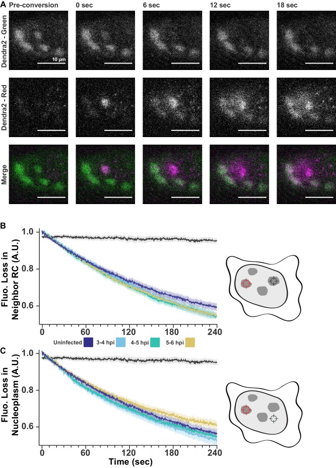
Figure 2—figure supplement 2. FLIP shows exchange within and between RCs.

Figure 2—figure supplement 2.

(A) Dendra2 photoconversion shows Pol II exchanges with nucleoplasm. Cells stable expressing Dendra2-Pol II were infected with HSV1. Fluorescence was monitored in both the green channel (pre-conversion), and red channel (post-conversion). A 1 µm spot of 405 nm light was used to convert one RC from green to red, alternating between photoconversion and frame acquisition. All scale bars are 10 µm. (B) FLIP measurements as in Figure 2F, except separated by time post infection. All times after infection show the same decay coefficients. (C) FLIP measurements of the loss of fluorescence in the nucleoplasm outside of RCs. All times after infection show similar decay coefficients.
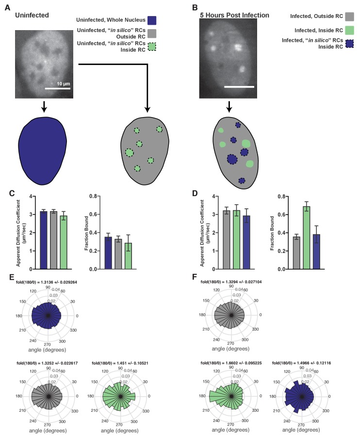
Figure 2—figure supplement 3. Comparison of bona fide RCs with RCs generated in silico.

Figure 2—figure supplement 3.

(A) Example workflow for uninfected cells, where either just the nucleus was masked (left), or the nucleus was masked and RC-sized annotations were randomly placed inside the nucleus (right). (B) Example workflow for HSV1-infected cells, where both the correct annotations based on the widefield image and randomly shuffled RCs were generated for all measured cells. (C) Spot-on measurements of trajectories after inside/outside classification in uninfected cells. In silico shuffling of RC positions has very little effect on either the measured apparent diffusion coefficient or the fraction bound. Error bars are the standard deviation of the mean, calculated from 100 iterations of randomly subsampling 15 cells without replacement and fitting with the model. (D) Similar to (C), but for infected cells. Real RCs show an increase in fraction bound, whereas in silico shuffled compartments show no difference with trajectories outside RCs. (E) Angular distributions of Pol II trajectories in the regions marked in (A) Fold(180/0) is the mean plus/minus the standard deviation, calculated from 100 iterations of randomly subsampling 15 cells without replacement and fitting with the model. (F) Angular distributions of Poll II trajectories in the regions marked in (B). Fold(180/0) is the mean plus/minus the standard deviation, calculated from 100 iterations of randomly subsampling 15 cells without replacement and fitting with the model. All scale bars are 10 µm.
Figure 2—video 1. Example of SPT data from an uninfected cell.
Download video file (43.5MB, mp4)
DOI: 10.7554/eLife.47098.012
Example 500 frames, played at 1/10th normal speed, from SPT data collected for the cells shown in Figure 2B from an uninfected cell (Figure 2—video 1) and a cell infected for 4 hr (Figure 2—video 2). Examples were taken from data sets with relatively high densities of localizations per frame to illustrate tracking and sorting into compartments, but in general the localization density was kept much lower, at approximately 0.5 localizations per frame.
Figure 2—video 2. Example of SPT data from a cell 4 hpi.
Download video file (42.4MB, mp4)
DOI: 10.7554/eLife.47098.013