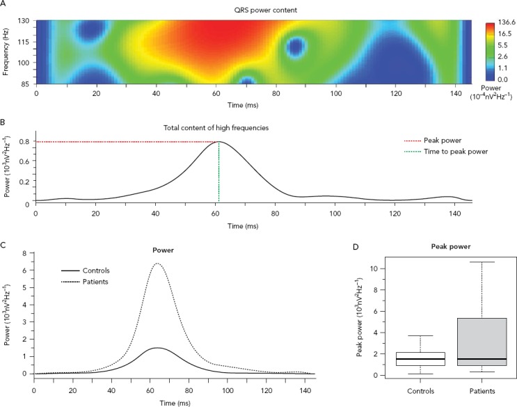
Figure 3: High-frequency Content Analysis Along the QRS.

High-frequency content analysis along the QRS with the wavelet analysis for comparison between patients with and without prior history of arrhythmic events. A: Power spectrum of the QRS; B: Cumulative power of the content at each each epoch (the red dotted line marks the peak power and the green dotted line marks time time to peak power); C: Time distribution of the high-frequency content for each group at each time epoch; D: Boxplot comparing the peak power. Source: García Iglesias et al. 2018.36 Adapted with permission from MDPI.
