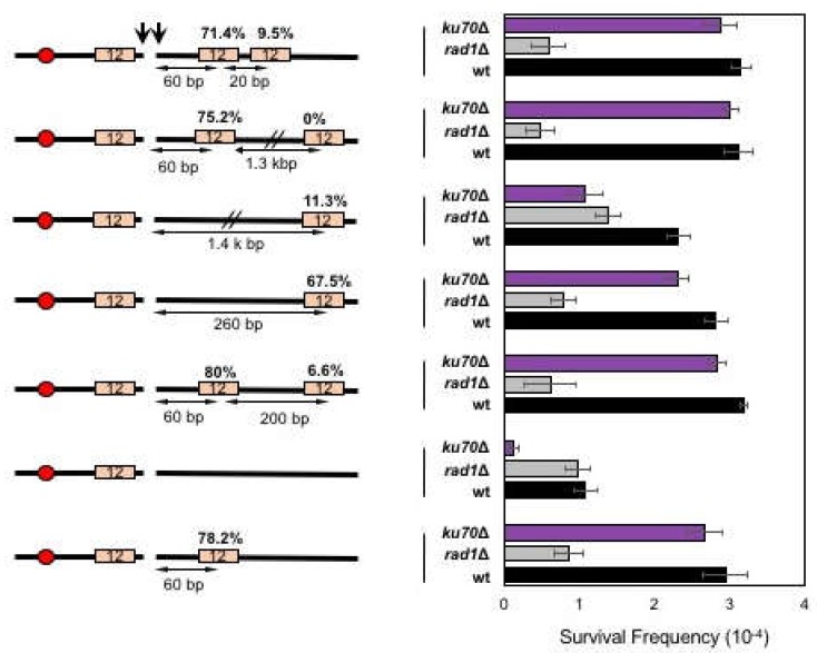
Figure 3.
The effect of proximity on microhomology selection for MMEJ. (Left) A diagram of MMEJ reporters with microhomologies located at different distances to an HO break. The locations of HO cut site (arrow), microhomology (orange boxes), and centromere (red circles) are shown. The size of microhomology is shown in number (bp) inside the microhomology. The distance to the break (bp) is shown below each microhomology. Percentage of repair event was calculated by dividing the number of repair events using each microhomology with the number of all repair events, regardless of the repair types and shown above each microhomology. The repair events were analyzed by sequencing of the repair junctions from >100 Ura- survivors. (Right) Graph showing survival frequency ± SD in wild type (WT), RAD1Δ (MMEJ deficient mutant), and ku70Δ (C-NHEJ deficient mutant). Survival frequency was calculated as described in Figure 1. The results are the average of three independent experiments.

