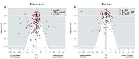
Figure 3. Funnel plots of variance ratio.
Funnel plots of outcome variance ratio between arms ( Panel A) and of outcome variance ratio over time ( Panel B). The first shows all 208 studies while the second shows the only 95 studies in which the variance of the difference between the baseline and final response was available. Vertical axis indicates precision for the comparison of variances; with points outside the triangle being statistically significant. Additionally, red points mark significant differences between the means, which correspond each study’s objective to assess main treatment effects. In Panel A, points on the right indicate higher outcome variability for the treated individuals, as expected if there is patient-by-treatment interaction; similarly, points on the left correspond to lower variability, although this is compatible with traditional Evidence-Based Medicine. Eleven (5.2%) out of 208 studies reported exactly the same outcome variability in both arms. We observe more red points on the left, indicating that changes in the average come with reductions in the variance. In Panel B, points on the right indicate higher variability in the experimental arm at the end of the study, as expected in a scenario of heterogeneous treatment effect; points on the left correspond to lower variability at the end, which implies a more homogenous response after treatment. The largest number of points on the left side indicates a majority of experimental interventions that reduce variability. In addition, several of these interventions yielded significant results in the main endpoint. V OT: Variance of the Outcome in the Treated arm. V OC: Variance of the Outcome in the Control arm. V BT: Variance of the Outcome at baseline in the Treated arm.

