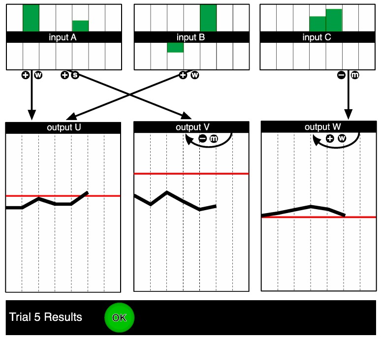
Figure 3.
Screenshot of system II as it was presented in the complete information condition for the control phase. The goals are indicated as red lines on the graphs for the output variables. The underlying structure of the system is represented on screen as a causal diagram, where the arrows represent the relationships between the variables, while the positive and negative signs denote the direction of the effect, and the letters the relative strength. In this example, Input A, B and C were increased on Trial 5. As a result, Output U increased, Output V increased, and Output W decreased, as depicted in the output variable windows.

