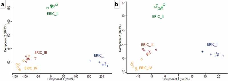
Figure 2.

Two PCA charts that illustrate the proteome differences in exoproteins of the four genotypes. Each of the symbols represents one biological replicate, and the analysis clearly demonstrates the homogeneity of the samples or analyses. The same numerals used to generate the heatmaps in Figure. 1(a) and Figure 1(b) were used to produce the charts in Figures 2(a,b), respectively. The similarity in ERIC III and IV and separate positions of ERIC II and ERIC I are clearly demonstrated.
