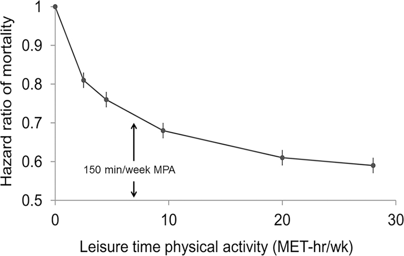
Figure 2. Relationships of Moderate-to-Vigorous Physical Activity to All-Cause Mortality, with Highlighted Characteristics Common to Studies of This Type.

Source: adapted from Moore et al., 2012 (17). Shown is the relation of leisure time physical activity amount and hazard ratios for mortality. The points shown represent the mortality hazard ratio for each of the physical activity categories; the vertical lines represent the 95% CIs for that physical activity category. The reference category no leisure time physical activity. The lines connecting the points help to illustrate the dose–response relationship between physical activity and risk of mortality; the shape of the association shown here is similar to that obtained using spline modeling. As discussed in the text and displayed in this graphic, the characteristics of this curve seems to apply for most studies of the relationships of moderate-to-vigorous physical activity with all-cause and CVD mortality, as well as with incident coronary artery disease, ischemic stroke and all-cause heart failure: there is no lower threshold for effect; there is a steep, early slope; about 70% of the benefit obtained by physical activity alone is reached by 8.25 MET-h/w (150 minutes of “brisk walking” (3 miles per hour); there is not apparent upper threshold for effect; there is no evidence for increased risk at the greatest amounts of physical activity; and there is not obvious “best amount”.
