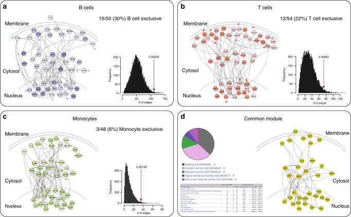
Fig. 3.
Cell-specific gene sub-networks of GW associated regions (r2 > 0.5). Graphs correspond to the largest connected component in each cell/tissue bucket. Nodes represent proteins and edges represent interactions. For each cell type the PRE is proportional to the color intensity (dark: high; light: low). Genes/proteins are organized according to their cellular distribution. The histogram next to each sub-network shows the distribution of the number of edges of 10,000 randomly generated networks. The red arrows denote the number of edges observed in the corresponding sub-network and the p-value, the probability of observing a more extreme number of edges in a randomly generated network. a B cells; b T cells; c monocytes. An asterisk is placed next to genes/proteins exclusively observed in that cell type. d shows an aggregate (common) module present in all three cell types. A pie chart describes the GO: molecular functions assigned to these genes and a table describes the nine PANTHER pathways that were significantly enriched

