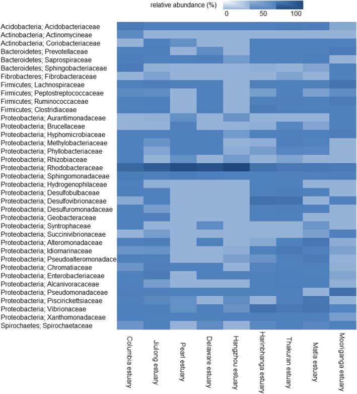
Figure 4.

Heat map shows the distribution of bacterioplankton communities in the studied estuaries. The colors represent the abundance of the particular bacterial family at the study site. It represents the distribution pattern of each bacterial family across the studied estuaries. The phylum and class of each bacterioplankton family are shown on the right‐hand side of the heat map
