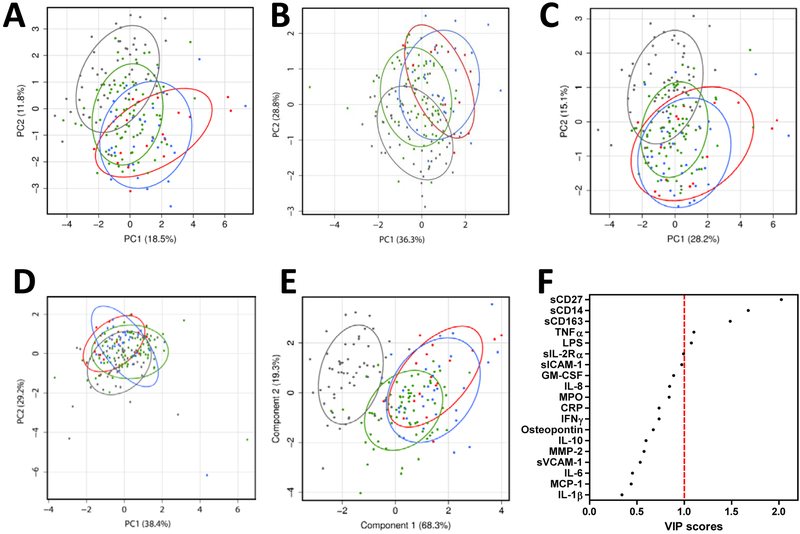
Figure 2. Effect of HIV on bioprofile visualization.
PCA biplots from first and second principal components utilizing on all 19 biomarkers (Panel A), lymphocyte biomarkers (Panel B), monocyte/macrophage biomarkers (Panel C), cardiovascular biomarkers (Panel D) are shown. Percentage shown on the X and Y axis indicates percentage of total variance explained by the components. In Panel E all 19 biomarkers were utilized to create PLS-DA plot maximizing separation among four groups using first and second components. Percentage shown on the X and Y axis indicates percentage of intergroup variance explained by the components. Panel F shows a VIP plot depicting relative contribution of all 19 soluble factors to four group classification. Healthy controls are represented by grey dots and ellipses, ART+VL- are green dots and ellipses, ART+VL+ are blue dots and ellipses, and ART-VL+ are red dots and ellipses. Ellipses indicate normal contour line within one standard deviation away from mean.

