
Figure 3.
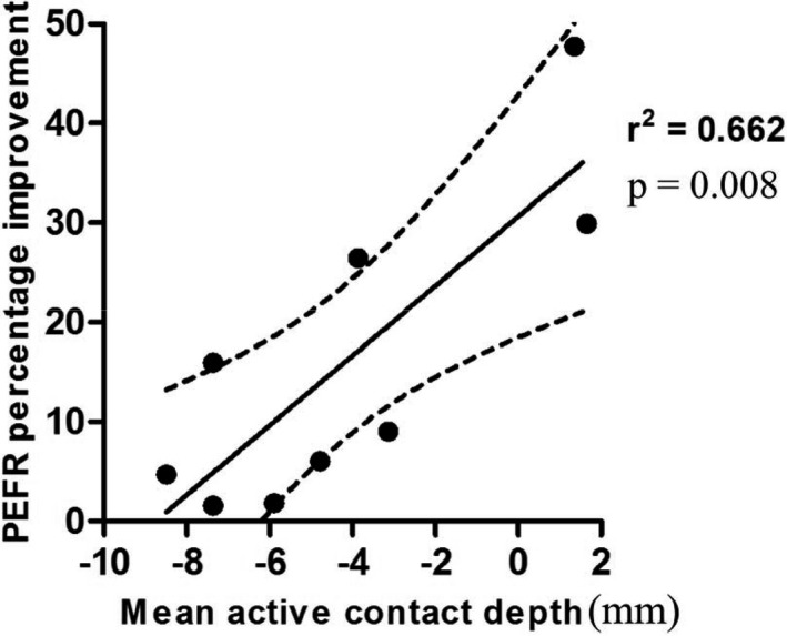
Scatterplot demonstrating the correlation between mean active contact depth from the pontomesencephalic line versus improvement in peak expiratory flow rate.
Official websites use .gov
A
.gov website belongs to an official
government organization in the United States.
Secure .gov websites use HTTPS
A lock (
) or https:// means you've safely
connected to the .gov website. Share sensitive
information only on official, secure websites.
Scatterplot demonstrating the correlation between mean active contact depth from the pontomesencephalic line versus improvement in peak expiratory flow rate.