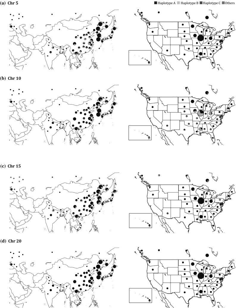
Fig. 7.

Distribution of haplotypes of trait-specific QTL for protein and oil on Chr 5 (a) and Chr 10 (b) and QTL for protein and oil on Chr 15 (c) and Chr 20 (d). The frequency of each haplotype, illustrated in pie charts, was placed according to the geographic locations of major populations from Russia, Asia and North America. Size of pie chart is correlated to the number of accessions in the region. Haplotypes are as described in Table 5. The figure map was created using the R package ‘maps’ and ‘mapdata’ in the R project
