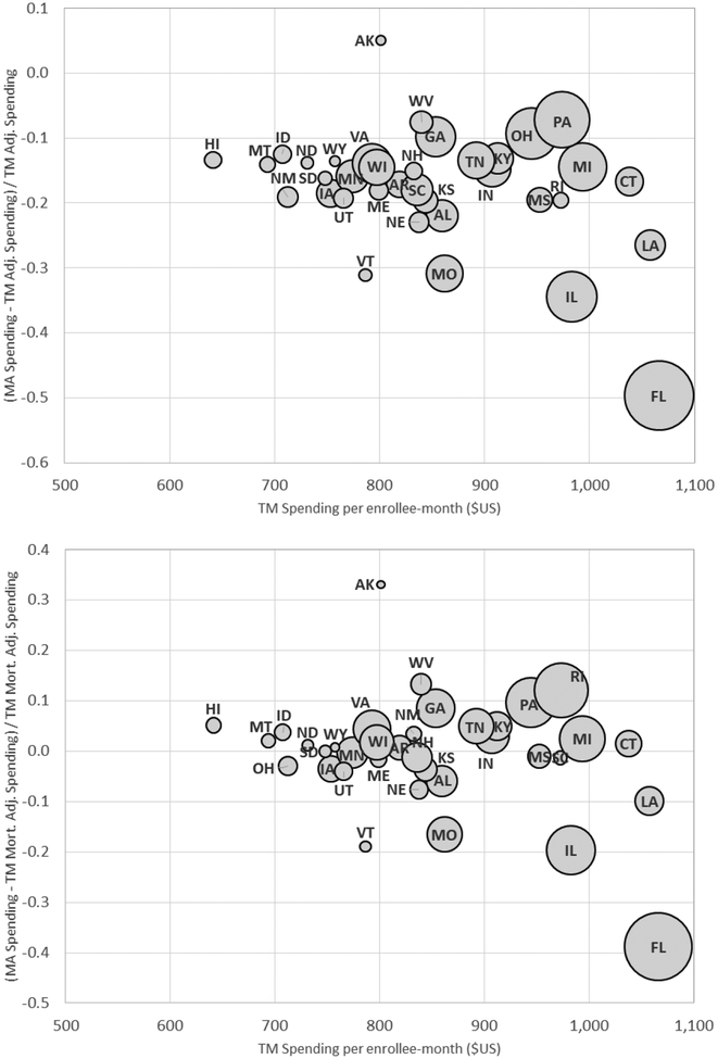
Figure 3: TM-MA Spending Differences across States.
Figure plots the (percentage) difference between average MA spending and (re-weighted) TM spending per enrollee- month against average TM spending for each of the 36 states in our baseline sample. The y-axis in the top panel compares MA spending to TM spending that is re-weighted to match the MA population on county and risk score, using our preferred weighting (see Table 2, Panel A, column (4)). The bottom panel does the same but using predicted mortality to adjust for selection on unobservables (see Table 2, Panel B, column (4)), as described in Section III. The size of each bubble is proportional to the number of total Medicare enrollees in the state. The x-axis reports average (unadjusted) TM spending in the state (see Table 2, Panel A, column (1)).

