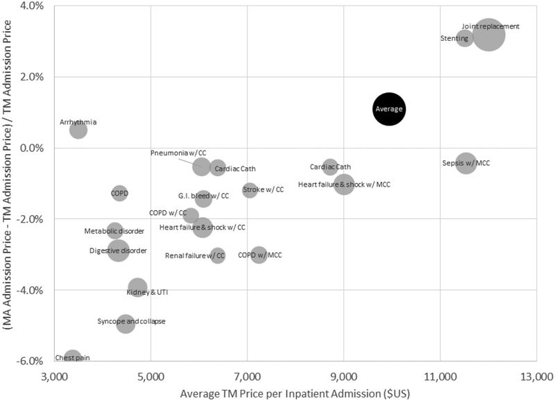
Figure 4: TM-MA price differences for inpatient admissions, across DRGs.
Figure plots the (percentage) difference between average MA prices and TM prices for a hospital admission, overall and for the 20 most common DRGs in MA. Average MA or TM prices for a given DRG are computed using a common (MA) basket of state admission shares for that DRG. The national average price in MA or TM is computed by weighting each DRG (including the less common ones not shown here) by its (national) share of MA admissions. The size of each bubble (except for the overall “Average” bubble) is proportional to the number of MA admissions with that DRG.

