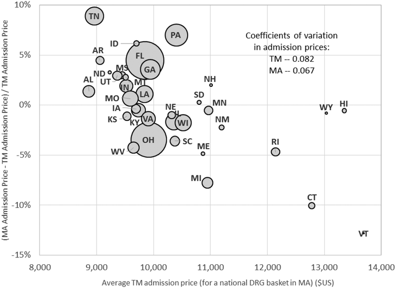
Figure 5: TM-MA price differences for inpatient admissions, across states.
Figure plots the (percentage) difference between average MA prices and TM prices for a hospital admission for each state in our baseline sample (except Alaska which is omitted because it has too few inpatient admissions for us to report). Averages are computed for each state using a common (MA) “basket” of DRG admission shares. The size of each bubble is proportional to the number of MA admissions in that state. Coefficients of variation across states in prices are computed using total Medicare enrollees in the state as a weight.

